Warning: The images and opinions below contain numbers and graphs…about the behavior of men and women…when they’re dating…online. Proceed with caution…but definitely proceed!
You can thank Christian Rudder, one of the founders of the online dating platform OkCupid, for the late night arguments conversations you will get into after showing your significant other, friends, and family charts like this one:
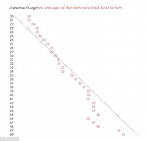
And this one:
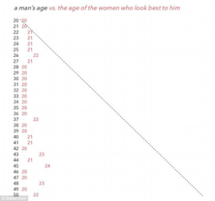
Mr. Rudder’s book, Dataclysm, is an amazing resource for fans of love, math, American culture, and/or the endless ways what we type & click is more revealing than what we say.
One of the most powerful sections of this book is Chapter 6, “The Confounding Effect”, which deals with how online daters of various racial groups see each other. (Sidenote: The charts below only reflect data from men and women who identified as ‘straight’ on their online dating profiles. For all of our friends holding down other points on the spectrum of sexuality, the author presents some fascinating data in Chapter 11 of this book.)
Mr. Rudder makes a powerful claim in Chapter 6:
“Unlike other features on OkCupid, there is no visual component to match percentage. The number only reflects what you might call their inner selves – everything about what they believe, need, and want, even what they think is funny, but nothing about what they look like. Judging by this compatibility measure, the four largest racial groups on OkCupid – Asian, black, Latino, and white – all get along about the same. In fact, race has less effect on match percentage than religion, politics, or education. Among the details that users believe are important, the closest comparison to race is Zodiac sign, which has no effect at all.”
As a proud Gemini, I will reserve comment on the relevance of Zodiac signs! Aside from that, Mr. Rudder’s findings seem to match the narrative we’ve crafted around how American millennials think about their peers from various ethnic backgrounds….until he breaks out some more data:
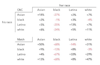
Just so we’re clear, the percentages represent the difference above or below the average within each racial group. So, in the first chart, the +18% stat in the first row & first column of the OkC table means that the Asian men users of OkCupid included in this study rated Asian women users 18% higher than the average rating they gave to women of other races on the site. Now, take another look at that chart…
Okay…there’s so much here…I don’t pretend to have the answers…but I have a lot of questions. Here are some of my questions. They may not even be the right questions. Even though “it’s just a dating site”, I think this data can open the door to the kind of real talk that may help us engage some of the larger questions about how we will all get along in this country…at least I hope it can.
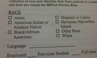
There are few things as vexing as the “Check Your Race below” boxes that seem to appear on every form that is attached to an application for something important. I am interested in this post about the effect of these “race boxes” on romantic capital.
In no particular order:
- How do you choose which race box to select on an online dating form? Is it the same choice you make for job, college, and/or loan applications? Do you choose a box based on the way you see yourself?…or based on the way you think potential romantic partners will see you? Is there a MTV show, Catfish-like feeling when the race box you choose is different from the race box your potential online dater would choose for you?
- How do we even begin to understand the implications of the streak of red percentages under the column for Black women (noting the fact that a diaspora of cultures is represented in this label)? What does it mean for our society when women who identify as Black seem to be receiving “below-average” ratings relative to women of other ethnicities? What does it mean for Black men that we seem to be the only group of men who give women from “our group” lower ratings than the average ratings we appear to give to women from other ethnic groups?
- How do women who identify as Asian (again acknowledging the large sections of Earth covered by the cultural diaspora of this label) think about their “above average” ratings across-the-board in relation to their lived experiences moving through American society? How do they understand these results in relation to the forms of representation of Asian women receive in popular media?
And now the guys:
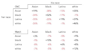
- How do men who identify as White (a very diverse group of cultural heritages included in this label as well) think about their across-the-board “above average” performance with women from the four groups included in these charts? How do they connect their current individual statuses in life with their larger cultural status as suggested by this data?
- How do women who identify as Latina (acknowledging the wide range of cultures included in this label) understand their exclusive preference for Latino and White men as suggested by this chart?
- In a #BlackLivesMatter moment, what does the red streak of “below average” ratings for Black men indicate about American millennials? What does it indicate for the members of the Black diaspora that Black women’s support for Black men does not seem to be diminished….either by the opinions of women from other ethnicities….or by the opinions of Black men as suggested by the first chart.
Wow…this is going to take longer than I thought…To Be Continued.
– Day G.
Host, Class of Hope & Change
